Wednesday, January 16, 2013

Tuesday, January 15, 2013

Poster with Smoke-FINISHED

In this picture i was working with smoke again. This poster I made is meant to look like the Coldplay/Apple poster. I think it turned out really well, I had to use a lot of familiar tools and it was nice to get more practice with them.

Skull-Smoke-FINISHED

Here is my completed skull made out of smoke. It took some time to get the smoke to blend correctly but overall I like the look of this, I applied multiple duplicates of several types of smoke in order to get it to cover the skull. Once I did that I used the burn and dodge tools in order to make certain parts stand out in the smoke and tone down other areas. Then to finish it all off I used a gradient map in order to get a green to yellowish color on the skull and it's surrounding area.

Friday, January 11, 2013

Smoke Manipulation

I wanted to learn how to create cool smoke effects so I found a tutorial online that teaches you how to create a cool smoke cloud in the shape of a skull so I decided I would try to do it. I started out by cutting out a skull, some smoke, and a head. After that I switched the skull so it would be black with white highlights and placed it so it looked like the smoke was leading into it. I then cut out a second piece of smoke and am currently warping it to fit the shape of the skull. After this I will add some more smoke to the eye sockets and the back of the skull.

Wednesday, January 9, 2013

Painted Sphere- FINAL


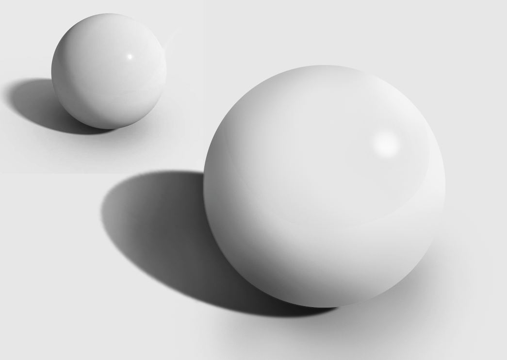
Well after a long and hard battle with this sphere I have gotten to a point where I am pleased with it. Even though it is not an exact copy of the sphere in the reference photo, it does look like a sphere. I do plan to go back and add in a shadow, hopefully that will look like the one we are copying. However, on the whole I am happy with the sphere I have made.

Monday, January 7, 2013

Abstracts- Finished


These are 3 abstract designs I made using various tools in Photoshop. For the first one I had to use lens flares and blurs along with creating new patterns to get that boxy look in the background. I also had to cut out the Boba Fett head in order to put it in the signature and still see the background. Then I changed its properties to get the color to change so it would stand out more.  The second picture I made I had to create a new brush pattern by drawing a curve with the pen tool. This took me a bit to figure out because in the tutorial the person was using a pressure sensitive tablet while I was not. After painting with the new brush and making the lines red I made a color overlay to get the blue and green effects on the red lines. In the third picture I had to get new brushes in order to create a similar picture to what they had. After creating a design with the brushes I used Polar coordinates to create a spiral effect. I then edited the layer's properties to get the image to stand out more and be sharper. I then decided to repeat this process to add another little portion to it so it would look more complete. After finishing the actual abstract I then put in some words and made them look beveled.