Tuesday, December 18, 2012
Painted Sphere
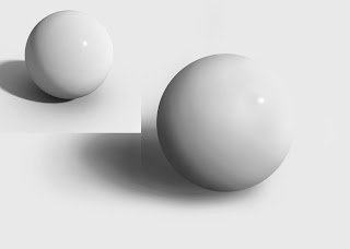
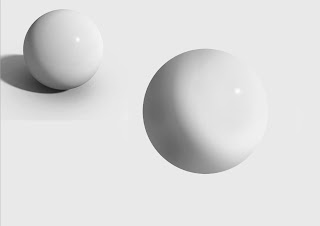
Here are two copies of the sphere I am working on. The top picture is my first attempt, I am not entirely pleased with it due to the striations in the shadow. These lines make the sphere more matte looking versus the glossy look we are trying to duplicate. This picture would look fine if we wanted the rougher looking sphere, however we don't. The second picture is my next try where i am working on making the sphere look more like the original picture that we want to recreate. This project is pretty tough due to the issues of painting and how it creates either a blotchy look or lines of different colors. I would like to see if I can start over again and instead of using a flow of 1 use a opacity of 1. This might make a more even looking shadow or highlight I would like to test it though to find out.
Subscribe to:
Post Comments (Atom)


No comments:
Post a Comment