Wednesday, January 16, 2013

Tuesday, January 15, 2013

Poster with Smoke-FINISHED

In this picture i was working with smoke again. This poster I made is meant to look like the Coldplay/Apple poster. I think it turned out really well, I had to use a lot of familiar tools and it was nice to get more practice with them.

Skull-Smoke-FINISHED

Here is my completed skull made out of smoke. It took some time to get the smoke to blend correctly but overall I like the look of this, I applied multiple duplicates of several types of smoke in order to get it to cover the skull. Once I did that I used the burn and dodge tools in order to make certain parts stand out in the smoke and tone down other areas. Then to finish it all off I used a gradient map in order to get a green to yellowish color on the skull and it's surrounding area.

Friday, January 11, 2013

Smoke Manipulation

I wanted to learn how to create cool smoke effects so I found a tutorial online that teaches you how to create a cool smoke cloud in the shape of a skull so I decided I would try to do it. I started out by cutting out a skull, some smoke, and a head. After that I switched the skull so it would be black with white highlights and placed it so it looked like the smoke was leading into it. I then cut out a second piece of smoke and am currently warping it to fit the shape of the skull. After this I will add some more smoke to the eye sockets and the back of the skull.

Wednesday, January 9, 2013

Painted Sphere- FINAL


Well after a long and hard battle with this sphere I have gotten to a point where I am pleased with it. Even though it is not an exact copy of the sphere in the reference photo, it does look like a sphere. I do plan to go back and add in a shadow, hopefully that will look like the one we are copying. However, on the whole I am happy with the sphere I have made.

Monday, January 7, 2013

Abstracts- Finished


These are 3 abstract designs I made using various tools in Photoshop. For the first one I had to use lens flares and blurs along with creating new patterns to get that boxy look in the background. I also had to cut out the Boba Fett head in order to put it in the signature and still see the background. Then I changed its properties to get the color to change so it would stand out more.  The second picture I made I had to create a new brush pattern by drawing a curve with the pen tool. This took me a bit to figure out because in the tutorial the person was using a pressure sensitive tablet while I was not. After painting with the new brush and making the lines red I made a color overlay to get the blue and green effects on the red lines. In the third picture I had to get new brushes in order to create a similar picture to what they had. After creating a design with the brushes I used Polar coordinates to create a spiral effect. I then edited the layer's properties to get the image to stand out more and be sharper. I then decided to repeat this process to add another little portion to it so it would look more complete. After finishing the actual abstract I then put in some words and made them look beveled.

Tuesday, December 18, 2012

Painted Sphere


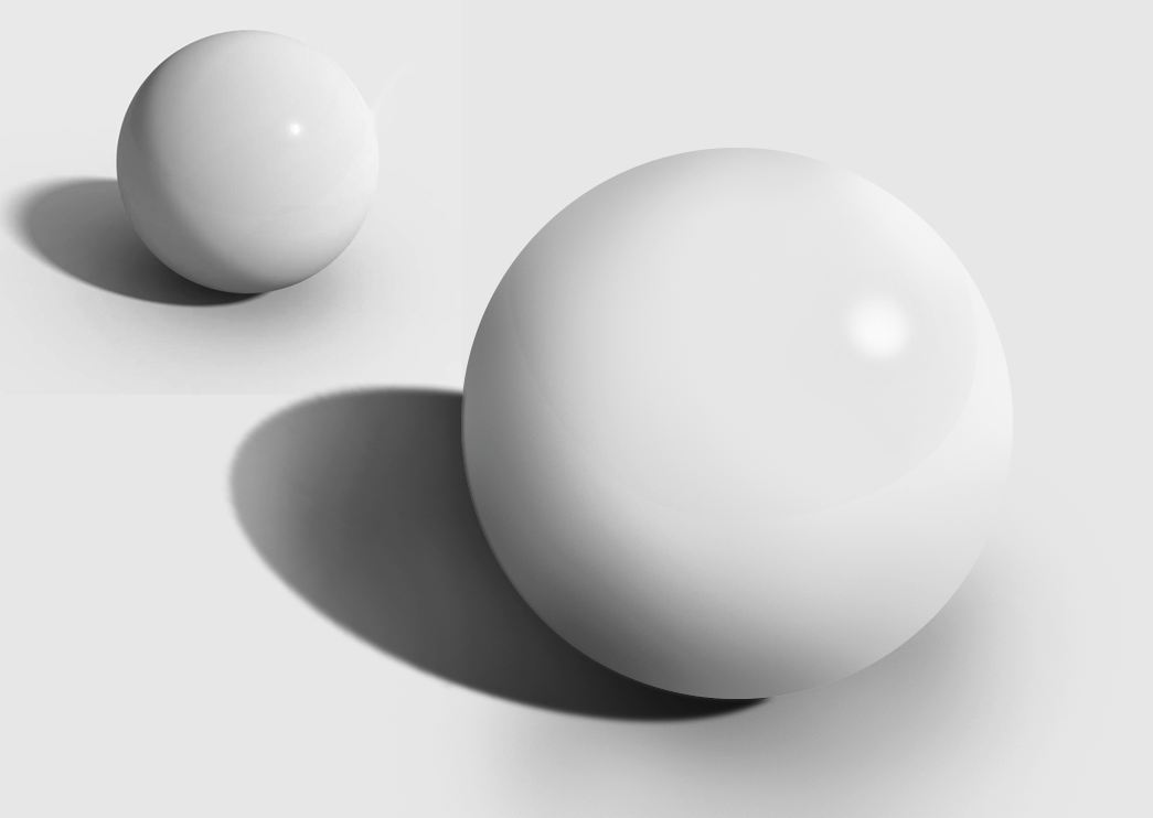
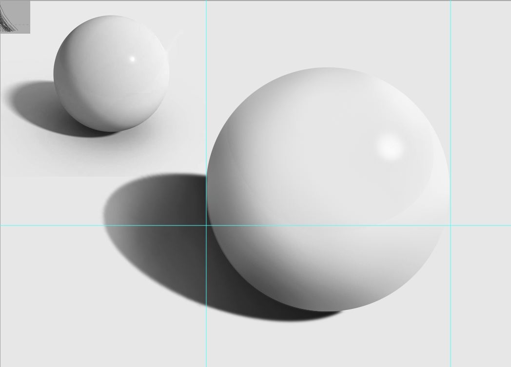
Here are two copies of the sphere I am working on. The top picture is my first attempt, I am not entirely pleased with it due to the striations in the shadow. These lines make the sphere more matte looking versus the glossy look we are trying to duplicate. This picture would look fine if we wanted the rougher looking sphere, however we don't. The second picture is my next try where i am working on making the sphere look more like the original picture that we want to recreate. This project is pretty tough due to the issues of painting and how it creates either a blotchy look or lines of different colors. I would like to see if I can start over again and instead of using a flow of 1 use a opacity of 1. This might make a more even looking shadow or highlight I would like to test it though to find out.

Friday, December 14, 2012

Painted Sphere

Today we were told to paint a photo realistic sphere. This seemed really daunting at first but once I got started it wasn't so bad. However I ran in to the issue that my painting looks like just that, a painting. My strokes make it look more like a hand painted sphere than a photo of one. I plan to fix this and hopefully make it look more like a photo.

Wednesday, December 12, 2012

Painting A Sphere

In this picture you see a sphere. I created this by painting a regular blue circle with varying shades of the same color. i created a shadow on one side opposite where I placed the hotspot. The hotspot shows which direction the light is shining on the sphere from. My next goal is to create a realistic shadow for the sphere.

Monday, December 10, 2012

Experiments with brushes


In Photoshop we are learning about different brushes and how the brush tool works. We are also learning the different ways we can manipulate the tool. in the pictures below i first changed the different settings that the brushes have. I had scattered the pattern and also changed the hue so it would cycle through colors. I also had multiple brushes stack on one another. After that i created gradients by painting one color at a time in order to create a picture that looked like the colors were blending into the others.

Tuesday, December 4, 2012

Fractals


Today I was working with Apophysis and experimenting with different settings. These are what I got...

Friday, November 30, 2012

One Point Perspective Room


Here is my room which I made using One Point Perspective. I added a door, a rug, and a window and I plan to add a television soon.

Wednesday, November 28, 2012

Haunted House

I this picture I added some paint damage to the house as well as some Graffiti . I think this adds to the picture making it feel more creepy.

Drawing a One Point Perspective Room


Here are two shots of my room using one point perspective. The first is without the guides and the second is with them. I made the walls, the floor and the ceiling using the line tool.

Monday, November 26, 2012

Haunted House

Here is my updated haunted house. I'm not really proud of it yet, but I'm unsure of how to improve it. I added some fog and gravestones along with darkening the sky. I think this would've been easier to do if I had had a different house. The house I have currently, has issues because the picture itself was odd and there were issues with the colors becoming over-saturated. I think I fixed most of those problems but I still don't feel comfortable stopping here.

One point Perspective

Here is a diagram showing the parts of a One Point Perspective photo. The red lines show lines from the picture which all lead to the Vanishing Point. The Vanishing point is shown as a blue dot, this dot is also located on the Horizon Line shown in green. The light blue lines indicate the vertical lines in the photo.

Monday, November 19, 2012

Huanted House- Restart

Here is that start of my newest attempt at the haunted house.


 These above are some more abstracts I created using Apophysis.
 This is my attempt at lightning. While it may not look realistic due to the colors, I wanted to learn how to for future use.
This is a continuation of my haunted house. I had to start over because my pictures were not big enough. I am not done with this nor am I totally pleased. i think It could use some improvement with getting the colors and the lighting correct. This house has been a challenge for me and i am still not sure what I could do to make it look haunted enough while still retaining the integrity of the picture.
Thursday, November 15, 2012

Tuesday, November 13, 2012

Haunted House

Here is my Haunted house. It is still a work in progress, however it is getting there. Today i added some sun rays but they aren't very visible. I also added broken windows along with some adjustments with the brightness and contrast.